Advanced Hover and Focus Interaction Patterns
Building accessible interactive states without JavaScript
Why Interaction States Matter
Hover and focus states are the primary clues that tell people “this area is interactive.” When these affordances are missing or poorly implemented, users who navigate by keyboard, voice or switch controls are left guessing. WCAG 2.2 requires that interactive elements provide visible focus indication and that information conveyed on hover is also available on focus. Meeting that requirement is possible with pure CSS—no JavaScript necessary.
Guiding Principles
- Focus parity: Anything that appears on
:hovermust appear on:focusand ideally:focus-visible. - Motion safety: Prefer
@media (prefers-reduced-motion: reduce)to disable complex transitions for motion-sensitive users. - Large hit targets: Touch users do not have a hover state; make sure focused/activated elements have generous padding.
CSS Selectors You’ll Lean On
The modern selector trio for stateful design is:
a:hover,
a:focus,
a:focus-visible {}

.parent:focus-within {}

input[type="checkbox"]:checked + .panel {}
:focus-visible targets keyboard focus without overriding author-defined focus rings for mouse users. :focus-within lets a container react when any child receives focus—key for disclosure widgets and menus.
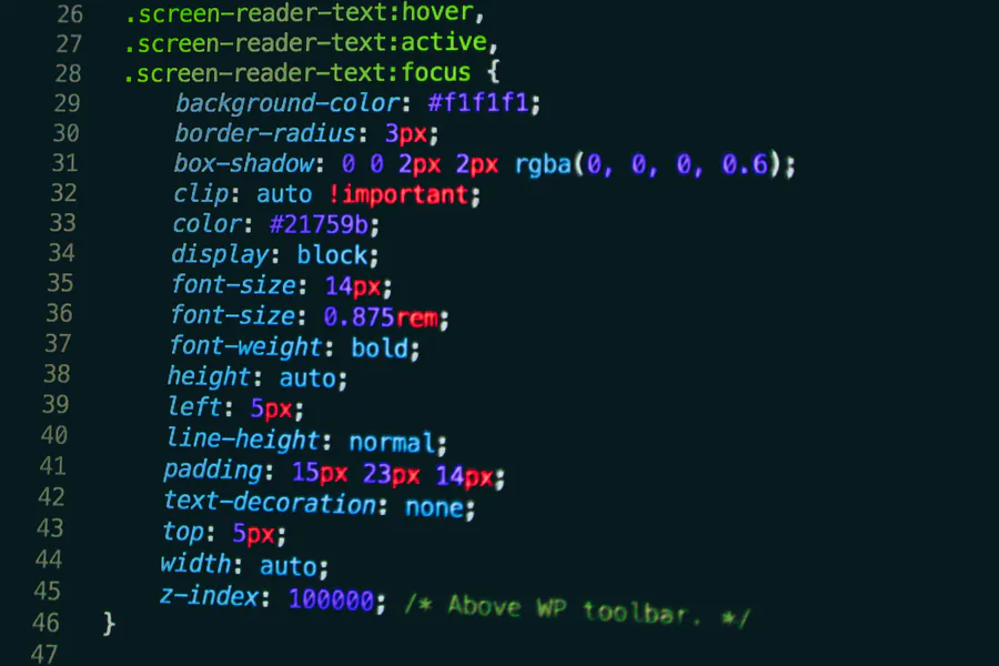
Pattern 1: Tooltip on Hover & Focus
Tooltips must never be hover-only. The markup below uses aria-describedby to reference the tooltip, which is visually hidden by default and shown on hover or focus.
<button aria-describedby="tip1" class="icon-btn">?</button>
<span role="tooltip" id="tip1" class="tooltip">Extra info</span>
.tooltip {
position: absolute;
opacity: 0;
transform: translateY(.5rem);
transition: all .2s;
}
.icon-btn:hover + .tooltip,
.icon-btn:focus + .tooltip,
.icon-btn:focus-visible + .tooltip {
opacity: 1;
transform: none;
}Pattern 2: Expanding Card
A card can reveal more text when users choose to interact, keeping previews uncluttered.
<a href="#" class="card">
  <h4>Project Alpha</h4>
  <p class="meta" aria-hidden="true">January 2026</p>
  <div class="details">Full description…</div>
</a>
.card {
display: block;
border: 1px solid #ccc;
overflow: hidden;
}
.card .details {
max-height: 0;
transition: max-height .3s ease;
}
.card:hover .details,
.card:focus .details,
.card:focus-visible .details {
max-height: 8rem; /* enough for content */
}Pattern 3: Pure-CSS Dropdown Navigation
Checkbox toggles, paired with :focus-within, allow a dropdown that stays open for keyboard users and closes on blur.
<nav class="menu">
  <input type="checkbox" id="toggle" class="menu__toggle" />
  <label for="toggle" class="menu__button">Products</label>
  <ul class="submenu">
    <li><a href="#">API</a></li>
    <li><a href="#">CLI</a></li>
    <li><a href="#">SDK</a></li>
  </ul>
</nav>
.menu__toggle {
position: absolute;
clip: rect(0 0 0 0);
}
.submenu {
max-height: 0;
overflow: hidden;
transition: max-height .25s ease;
}
.menu__toggle:checked ~ .submenu,
.menu:focus-within .submenu {
max-height: 20rem;
}The checkbox hack keeps the menu open for pointer users, while :focus-within covers tab navigation between links.
Pattern 4: Toggle Button Without JavaScript
The same checkbox approach can create an ARIA-compliant toggle button.
<input type="checkbox" id="darkmode" class="visually-hidden" />
<label for="darkmode" role="button" aria-pressed="false" id="dmLabel">
  Dark mode
</label>
#darkmode:checked + label {
background: #000;
color: #fff;
}
#darkmode:checked + label[aria-pressed] {
aria-pressed: true;
}Because ARIA attributes cannot change in CSS, the aria-pressed value is static here; screen-reader users will still understand via the native checkbox state. Where dynamic ARIA attributes are mandatory, JavaScript becomes necessary.
Pattern 5: CSS-Only Tabs
Radio buttons stitch together a fully keyboard-accessible tab set.
<div class="tabs">
  <input type="radio" name="tabs" id="t1" checked>
  <label for="t1">HTML</label>
  <input type="radio" name="tabs" id="t2">
  <label for="t2">CSS</label>
  <input type="radio" name="tabs" id="t3">
  <label for="t3">SVG</label>

  <div class="panel html">…</div>
  <div class="panel css">…</div>
  <div class="panel svg">…</div>
</div>
.panel { display: none; }
#t1:checked ~ .html,
#t2:checked ~ .css,
#t3:checked ~ .svg { display: block; }
label:focus,
label:hover {
outline: 2px solid #0b7;
}The radios live outside the visible area or are hidden with position: absolute;. Because they remain in the tab order, screen readers announce them as expected, aligning with the ARIA Authoring Practices for tabs.
Testing Without a Mouse
- Unplug your mouse or use the Keyboard Access option in your OS.
- Use the Tab key to move through controls; confirm every hover state is reachable and visible.
- Activate Shift+Tab to reverse and make sure focus is not trapped.
- Run a screen-reader or browser DevTools Accessibility pane to verify logical order and roles.
Progressive Enhancement & When to Add JavaScript
CSS-only patterns shine for simple reveals, disclosures and theming toggles. Introduce JavaScript when you need:
- Dynamic ARIA attribute manipulation (
aria-expanded,aria-pressed). - Complex focus management (e.g., trapping focus within modals).
- Asynchronous data loading, animation timelines or user preference persistence.
Key Takeaways
- Combine
:hover,:focus,:focus-visibleand:focus-withinto guarantee parity across input modes. - Checkbox and radio hacks unlock toggles, tabs and dropdowns without scripting.
- Test with only a keyboard to ensure every visual cue is replicated for non-pointer users.
- Adopt a progressive enhancement mindset: start with semantic HTML, enrich with CSS, and layer on JavaScript only when accessibility demands dynamic behavior.