Why Direction Matters
Websites are consumed in hundreds of languages, some written left-to-right (LTR) like English and French, others right-to-left (RTL) like Arabic and Hebrew, and still others that mix vertical and horizontal text such as Japanese. If your CSS is hard-coded for one direction, the interface can become unreadable or unusable as soon as the document direction changes. Building with internationalization (i18n) in mind means adopting techniques that let your layouts flow naturally in both LTR and RTL contexts without duplicating style sheets.
1. Use the dir Attribute as a Source of Truth
HTML provides built-in direction metadata:
<html lang="ar" dir="rtl">
  ...
</html>
or on any subtree:
<section dir="rtl">...</section>Base your CSS on this attribute instead of hand-rolled .rtl classes. That keeps markup semantic and avoids accidental drift between markup and styles.
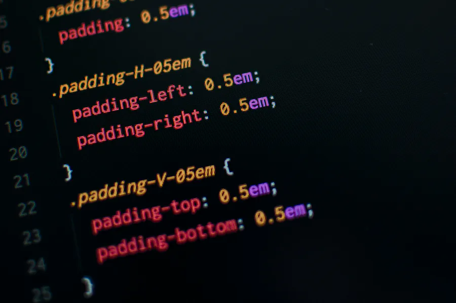
2. Prefer Logical Properties over Physical Ones
Traditional properties (margin-left, padding-right, border-top) are physical; their meaning changes in RTL. Logical properties describe the logical sides of a box, letting the browser resolve the correct physical edge automatically.
margin-inline-start&margin-inline-endreplace left/right marginspadding-block-start&padding-block-endreplace top/bottom paddinginset-inline-start&inset-inline-endreplace left/right positioning
.button {
  padding-inline: 1rem 1.5rem; /* start end */
  border-inline-start: 4px solid var(--brand);
}
The rule above produces a left border in LTR but a right border in RTL—no extra CSS needed.
3. Embrace Layout-Aware Modules
Flexbox
Flex items follow the document’s direction automatically when flex-direction is row. You almost never need separate RTL overrides.
.toolbar {
  display: flex;  /* children order flips between LTR & RTL */
  gap: 0.75rem;
}
Grid
CSS Grid also supports logical flow with the direction property. Avoid hard-coding grid-column-start: 1 when you actually mean “first side.” Use named grid lines instead:
.layout {
  display: grid;
  grid-template-columns: [start] 250px [content] 1fr [end];
}
4. The :dir() Pseudo-Class
Need an exception? Target elements by direction without extra classes:
input:dir(rtl) {
  background-image: url(icons/search-rtl.svg);
}
This keeps your stylesheet declarative and prevents unnecessary DOM mutations.
5. Writing Vertical Scripts
East-Asian languages sometimes prefer vertical text. Use writing-mode and logical properties together:
.callout {
  writing-mode: vertical-rl; /* top-to-bottom, columns right-to-left */
  margin-block: 2rem;
}
6. Mirroring Visual Assets
- Use
transform: scaleX(-1)to mirror icons when appropriate. - Keep arrow icons in neutral orientations (up/down) when direction is implicit.
- SVGs can declare
direction="rtl"to leverage<switch>elements for RTL paths.
7. Language-Specific Typography
Declare font stacks per language via the :lang() pseudo-class:
:lang(ja) {
  font-family: "Noto Sans JP", system-ui, sans-serif;
}
Combine with variable fonts to reduce asset weight.
8. Testing Checklist
- Add
dir="rtl"to the<html>element and open every page. - Click through all navigation flows—watch for misaligned icons or broken animations.
- Resize text to 200 % to catch overflow caused by longer translations.
- Test mixed LTR/RTL scenarios (e.g., English sentence containing a Persian phrase).
- Automate screenshots across directions using Playwright or Cypress.
9. Progressive Enhancement Strategy
Browsers that lack support for logical properties (mainly older Safari and IE) can receive a fallback file ordered after the modern sheet:
<link rel="stylesheet" href="styles-modern.css">
<!--[if lte IE 11]>
  <link rel="stylesheet" href="styles-legacy.css">
<![endif]-->
The cascade ensures newer browsers ignore the conditional comment while legacy ones still get usable CSS.
Conclusion
Internationalization is not an afterthought but a core part of inclusive design. By leaning on native CSS features—logical properties, flexbox, grid, :dir(), and language-aware selectors—you maintain a single stylesheet that gracefully adapts to any writing system. The payoff is a faster development cycle, fewer bugs, and a product that feels local everywhere.